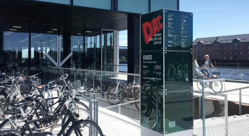
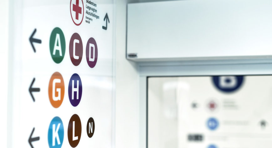
Wayfinding refers to information systems that provide people with directions or spatial understanding that will guide them through an environment. The directions are often displayed on signs but they can also be provided via e.g., supergraphics or visual elements like coloured lines on the floor, via technological devices providing verbal or visual directions, or via tactile elements like raised patterns on floors or walls. Architectural elements that aim to guide user flows are also relevant.
What is wayfinding?
Want to know more?

Most of us have experienced standing utterly confused in the lobby of a hospital, an airport terminal or a large public space looking for information. We know where we want to go – we might have the number of a specific hospital ward or a gate – but how do we get there?
Finding your way in a complex building or environment is not always an easy task. This is where good wayfinding knowhow can make a huge difference.
Wayfinding is of particular importance in places like these because they are large and complex spaces, which are hard to navigate. The more complex the space, the more guidance is needed in order to navigate with confidence.
In this article we want to share some of the knowledge we have gathered from studies of evidence-based literature and experience from working in the field, and introduce how we apply it in our work as wayfinding designers to create the best wayfinding designs on the market.
The knowledge behind our wayfinding design
Designing wayfinding systems that empower users to independently and confidently navigate spaces requires a deep knowledge of how people think and act when finding their way. By applying a profound understanding of how human beings find their bearings and navigate, we are able to design wayfinding strategies that encourage people to easily and intuitively find their way – irrespective of their capabilities – and leaving no one behind.
In the following sections we will elaborate on some of the main points to think about when designing spaces as well as wayfinding to aid orientation.
Intuitive wayfinding and orientation
In their endeavour to find their way, people enter into a dialogue with the space they are navigating. A process termed “the wayfinding loop” occurs:
At first, often unconsciously, we scan our surroundings for cues that can give us a hint about where we are going. A cue can be an actual sign. But it can also be the outlook through a window or a large memorable pillar in the middle of the room that helps us understand where we are in the building and where to go next.
Then, we move in the direction we assume to be right. As we move along, we gather new information that either confirms that we are on the right track or indicates that we have to change directions.
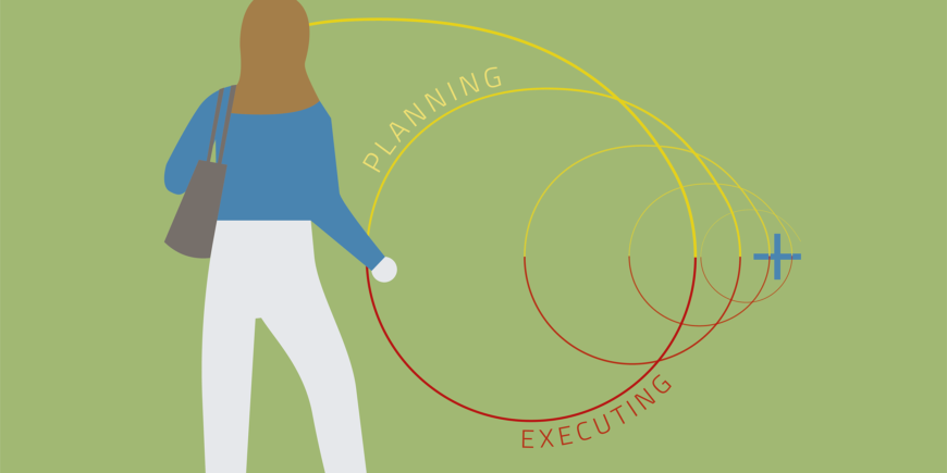
Hence a continuous circular process between planning and executing takes place until we reach our intended destination. The surrounding space communicates with the user via cues from the architecture and interior design while the user interprets the cues based on their previous experiences from similar environments and their individual capabilities to take in information.
Understanding the dialogue between the space and the user enables us as wayfinding designers to make wayfinding and navigation in complex spaces easier and more intuitive for everyone, irrespective of their abilities and preconditions.
Supporting the relationship between the built environment and its users
This can be done by supporting the interaction between the personal factors such as experience and capabilities and physical factors such as spatial features. By utilizing factors like sightlines and landmarks we can:
- Support the user’s navigation
- Improve the overall visibility and aid orientation
- Make important destinations recognisable and distinguishable.
As visual access to your destination makes any extra information to find your way superfluous, these factors aid navigation even without putting up signs.
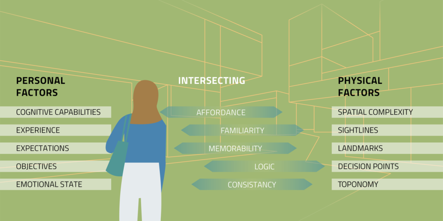
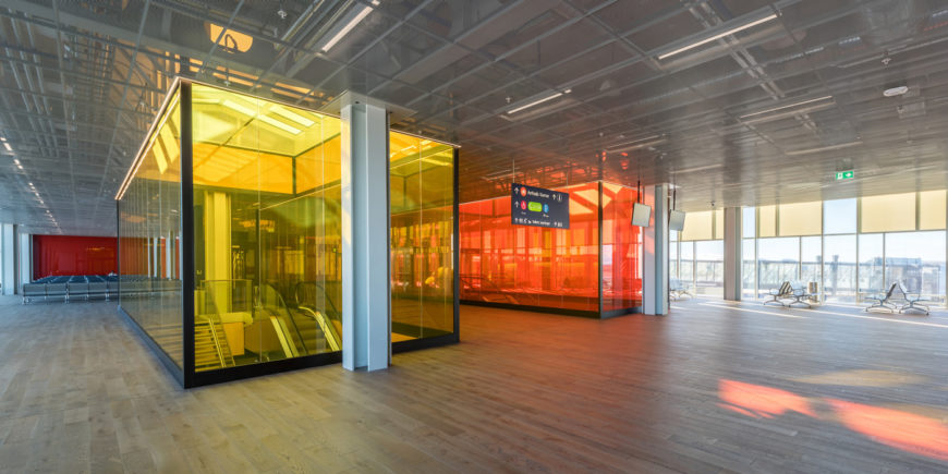
A more carefully conceived layout and more conscious deliberations of the interior design can therefore contribute to spaces that are visually more diverse and easier to distinguish from each other in large buildings like hospitals and airports that are often particularly complex due to their size and unvarying interiors.
Creating distinguishable spaces with wayfinding
When buildings are indistinguishable by design it is harder for users to know whether they are at the right place or not. Adding elements that contribute to variability and memorability is one way of creating spaces that help people find their bearings without increasing the complexity of the floor plan or the number of decision points.
Such variations in the design become part of our mental overview – our cognitive map – of the space. This cognitive map in turn becomes more and more detailed as we gain more information about the space. It is the ability to create cognitive maps that enables us to remember the route to a destination by heart without relying on signs or maps, placing confidence in the memorable elements of the space. Such elements can be designed specifically to contribute to the overall impression of the space while at the same time supporting the users’ navigation.
Are you curious and want to know how your space can be altered to make it easier to navigate for your users? Contact us, for more information.
Wayfinding Design Principles
Taking a point of departure in the knowledge presented above Triagonal has developed a line of principles that we consistently apply to make navigation simpler and clearer for as many different users as possible.
Wayfinding systematics principles
Creating a coherent wayfinding strategy requires a user-centred and logical approach to the development of the information systematics. The information systematics decides e.g. what to name things, what information is needed where and who needs to see it. In addition we always make sure that our wayfinding systematics are applicable to or prepared for being easily perceived and understood on digital platforms.
1. When you name areas and destinations it is paramount to base it on a logic and coherent system, which is easy to decode for the user. This creates predictability and makes it more intuitive for users to know where to search for their next destination. If you are standing in department A you will expect department B to be close by.
2. It is also important that wayfinding information is presented in a hierarchical manner, displaying only the relevant information to each specific context, and as precisely as possible. This is done by prioritising what kind of information is relevant to all users and what is only used by some at a specific location.
When the hierarchy is set you can differentiate the between different types of information by adjusting e.g. colours and size of graphic elements, like font sizes. By creating a clear hierarchy between different types of information, the amount of information presented at once is minimised, and it is therefore easier to decode the relevant information.
Other than organising information in a hierarchical manner in the physical environment, the need for supplying additional individualised information should be considered. This may for example include directions for people looking for alternative access routes, users with special language requirements or simply for those first-time visitors who need that extra confirmation to feel comfortable. Apart from for instance printed maps or other physical information sources a range of new technologies are potential platforms for conveying personalised digital information.
3. There is often a large amount of end destinations at e.g. hospitals and airports. Therefore, a principle of step-by-step navigation called “progressive disclosure” can be used as a means to reduce the amount of information at each decision point.
This is done by breaking down the journey into a number of natural sub-destinations instead of for example pointing towards each individual bed ward at the main entrance hall at a hospital, e.g. entrance – building A – main waiting area – level X – local waiting area – destination. In the entrance hall the signage only directs you to different buildings and then in the buildings you are led towards the main waiting areas etc.
4. Finally, a Danish proverb says that “exams are days of festivity for the well prepared” and this is also the case with wayfinding. Our ability to navigate is supported if we are can prepare ourselves for our visit to a specific place, which requires the possibility of accessing information (e.g. digitally) about our upcoming “journey”, what is going to happen and what else to expect.
Wayfinding graphic design principles
While the information systematics makes for the core structure of what information to provide when and where, the graphic principles is our guide with regards to how we communicate it.
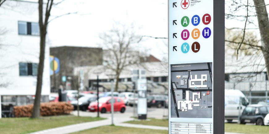
5. If combinations of different means of communication are applied, e.g., of colours, letters, numbers, raised patterns on walls or floors, sound and pictograms, we ensure that as many users as possible, irrespective of their preconditions, can decode the wayfinding systematics.
This allows e.g. people with dyslexia to navigate using colour codes or people with visual impairments to navigate using the raised patterns on the walls or on the floor. Different means of communication provide users with the ability to navigate using whatever means they are most comfortable with.
6. But we can also integrate the characteristics of the individual space into graphic and visual approach. By including characteristic spatial elements in the wayfinding system, we can support the natural affordances of the space and create optimal user flows.
This can be done e.g. by colour coding departments, using art or super graphics on walls or floors or by using lighting and furniture creatively. These elements can nudge our behaviour and strengthen our ability to find our bearings because they can function as landmarks along the route, hence supporting our memory and cognitive mapping. When these are respectfully integrated into the architecture, we experience a synergetic effect rather than making wayfinding a visually detached extra layer.
7. Finally, a digital or physical map of the space can enhance orientation for visitors by providing them with a quick overview over the route to their destination and the placement of different destinations in relation to each other.
Thus, the overview becomes part of our mental overview – our cognitive map – of the spaces. In many places it will be beneficial to place a map or another type of overview already outside the building at e.g. the parking lot. This will allow users to know by instinct what to look for as soon as they enter the building.
If the map is made tactile by raising e.g. walls and doors people with visual impairments can also gain an overview and be better prepared for their route. Such maps can be placed at several locations in the building to make the amount of information manageable and accessible.
By adhering to these seven wayfinding design-principles we believe that we are able to create the best wayfinding solutions – tailored both to the unique spatial conditions and the specific user group.
Do you want to know more about how we design wayfinding systems, or what we can do for you and your organisation? Get in contact here.


